Over the time span of 6 months we have been focusing our
photography project on transform photography and in this time looked at a wide
variety of different artists. This includes studying the work of Claes
Odenburg, Miguel Vallinas and Ulric Collette.
When gathering research and ideas to go towards my final piece, I found Ulric Collette, a Canadian photographer whose work inspired my final piece greatly. I found the subject of his generic photos very interesting and the actual techniques he used enabled the final product to look seamless. Although it wasn't his work that gave me the first idea for my final piece (that was a different artists work whose name I am unaware of), Collettes work strengthened my own ideas and worked more in the way I intended to. I didn't want to mimic his work exactly, so I was almost pleased when I realised how much I disliked the colours and moods of his photos because this meant there was something I could take and improve upon on my own to recreate his ideas in a way more preferable to me.
After I’d done this initial research into the work of other people, I did a couple of sketches to look further into facial features and some ideas I had to attempt to strengthen the idea I had in my head for my final piece. This helped me to think more about what I was doing and create a more developed piece of work, rather than create the first thing that came to mind.
During this project we carried out a number of photo-shoots and experiments as a class as part of our research into the topic ‘Transform’ and to later on give us ideas for our final piece.
One of the first experiments we did was in the style of Claes Odenburg, we used different foods and small objects to create scenes which we would later manipulate on Photoshop to add images of ourselves. This would create an almost tilt shift effect.
We also visited the zoo at one stage to collect images to try and recreate some of Miguel Vallinas’ work. This was a great opportunity and allowed us to experiment on Photoshop without having to take any images from the internet without permission.
As well as experimenting in photo-shoots, we researched a few new techniques to use on Photoshop to create some new and interesting images. In my opinion, this was great fun and really taught us a lot about things like layers and mask layers. We also improved upon techniques we’d used previously like the clone, burn and lasso tool. These came in useful and I ended up using all three tools when creating my final piece.
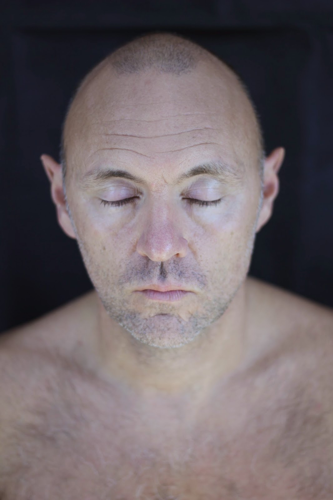
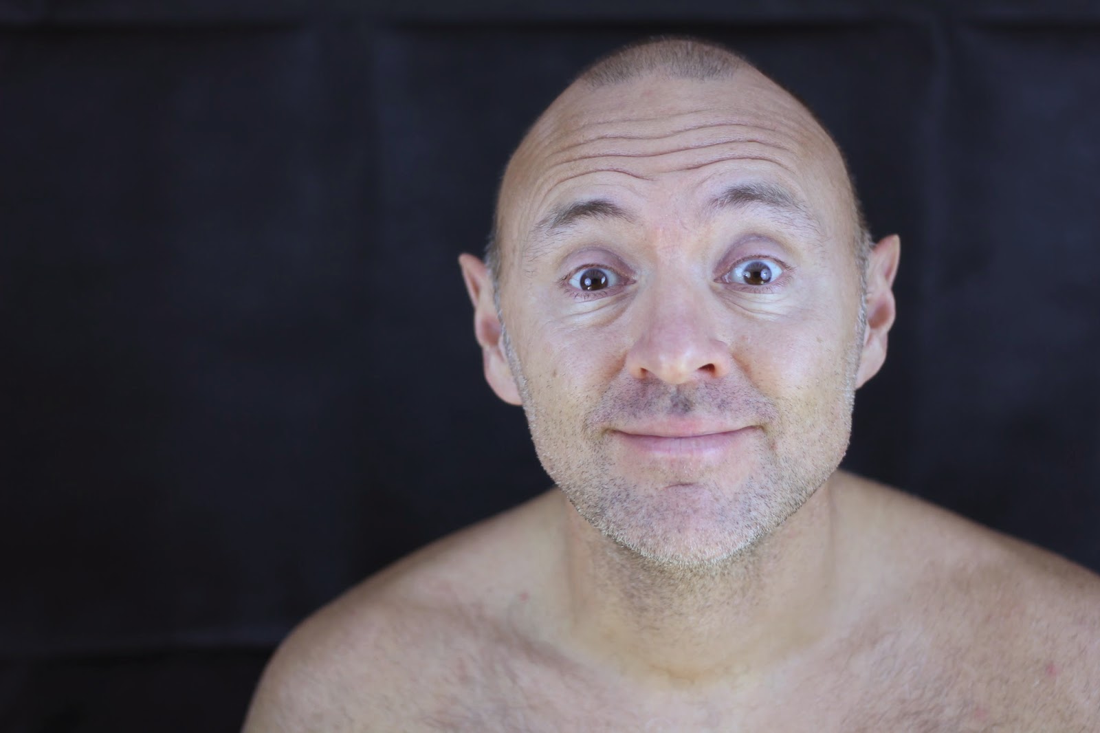
As well as using the aforementioned tools, when creating my final piece I took the photos in raw which enabled me to open them in the raw editor on Photoshop and get the best results out of it. For example, I severely altered the clarity, temperature and contrast of the photos, which becomes quite clear when you look at the original and edited ones next to each other. I wanted my final photos to be as striking as possible so I altered the highlights and shadows to get the results I wanted and then ever so slightly altered the hue to make the photos appear more red and blue, almost as if every vein in the subjects body was visible.
When gathering research and ideas to go towards my final piece, I found Ulric Collette, a Canadian photographer whose work inspired my final piece greatly. I found the subject of his generic photos very interesting and the actual techniques he used enabled the final product to look seamless. Although it wasn't his work that gave me the first idea for my final piece (that was a different artists work whose name I am unaware of), Collettes work strengthened my own ideas and worked more in the way I intended to. I didn't want to mimic his work exactly, so I was almost pleased when I realised how much I disliked the colours and moods of his photos because this meant there was something I could take and improve upon on my own to recreate his ideas in a way more preferable to me.
After I’d done this initial research into the work of other people, I did a couple of sketches to look further into facial features and some ideas I had to attempt to strengthen the idea I had in my head for my final piece. This helped me to think more about what I was doing and create a more developed piece of work, rather than create the first thing that came to mind.
During this project we carried out a number of photo-shoots and experiments as a class as part of our research into the topic ‘Transform’ and to later on give us ideas for our final piece.
One of the first experiments we did was in the style of Claes Odenburg, we used different foods and small objects to create scenes which we would later manipulate on Photoshop to add images of ourselves. This would create an almost tilt shift effect.
We also visited the zoo at one stage to collect images to try and recreate some of Miguel Vallinas’ work. This was a great opportunity and allowed us to experiment on Photoshop without having to take any images from the internet without permission.
As well as experimenting in photo-shoots, we researched a few new techniques to use on Photoshop to create some new and interesting images. In my opinion, this was great fun and really taught us a lot about things like layers and mask layers. We also improved upon techniques we’d used previously like the clone, burn and lasso tool. These came in useful and I ended up using all three tools when creating my final piece.
As well as using the aforementioned tools, when creating my final piece I took the photos in raw which enabled me to open them in the raw editor on Photoshop and get the best results out of it. For example, I severely altered the clarity, temperature and contrast of the photos, which becomes quite clear when you look at the original and edited ones next to each other. I wanted my final photos to be as striking as possible so I altered the highlights and shadows to get the results I wanted and then ever so slightly altered the hue to make the photos appear more red and blue, almost as if every vein in the subjects body was visible.
I had 3 original ideas before settling on which one I was going to do but it was a pretty easy decision as I wasn't too keen on my other ideas and felt they didn't fully relate to the theme of the exam. One of the ideas I had was to transform a girl's hood into the head of a wolf, I thought that this idea could look pretty cool and I even continued to take photos linking to this idea in my final photo-shoot but in the end I dropped it, feeling as though my other idea followed the brief a lot more.
The other unused idea I had was actually the one that sparked the idea for my eventual final piece. It was simply a face facing forward merging into the same face but facing sideways. As with the previous idea, it showed transform but only very loosely. However, the idea of two faces merging together made me start to think about two different faces merged together and then incorporating ageing into the piece as we had previously talked about in the project.
I took the photos for my final piece in my own time rather than at school because I prefer to use the backdrops and lenses I keep at home. To take the photos I used an umbrella light kit, an 18-55mm lens, a tripod and a stool. The tripod was used so that I could have more freedom with the exposure without having to worry as much about the photos blurring. I also used it when taking the photos of myself.
I chose two of the photos from my photo shoot and edited them on Photoshop separately, focusing especially on the colours, hues and contrasts. I wanted the photos to seem natural but unnatural at the same time. For example, the reds a little too red, the blues a little too blue. To do this I put a very slight hue filter on and manipulated the brightness, shadows, temperatures and saturations of the photos. After editing the two separate images I used mainly the lasso and clone tool to merge the two faces together, as well as incorporating some of the things we'd learnt about layers previously over the course of this project. When I'd gotten the picture right, I edited it so it was almost the opposite of the two individual pictures. This meant making it warm and gritty rather that cold and sharp. Using golds rather than blues and reds.
I presented my final piece by mounting them in frames I had specially made for me by my dad. Together, we made sure that the frames represented the person in them, so because I am younger than he, my frame was newer and smoother than his side which was slightly rougher and worn. All three frames were then mounted together using more wood.
I think that when you look over my blog and then at my final piece, it's very clear what my inspiration was. Although I have very much made it my own, you can see where my ideas stemmed from and what I took from them to include in my own work.
After my final piece was completed, I was surprisingly pleased with the actual success of the merge of the two faces. Of course it's not perfect but a lot of it is really down to a matter of preference and I'm quite pleased with how the photos turned out. I also think the colours of all three photographs contrast a lot and therefore in a strange way, compliment each other.
As I was creating my final piece, my ideas for presenting the work changed quite a lot. I always wanted them framed but the positioning and what else to include other than the main picture was never set in stone, though I'm glad I chose the option I did in the end.
For our next project, I'd like to spend more time partaking in photo-shoots so I have more material to use and hopefully more ideas will be generated from the recreations of other artists' work I make from my shoots.