Monday, 1 September 2014

Ideas and intentions- Based on work of others

One of the ideas I have for my final piece is to show the transformation between two people, older and younger. 

 These two photos are the sort of thing I want, the exception being the line in the centre. I want it to be more of a blend to give the impression that one face is becoming the other. This would be difficult to do with two people who don't have similar facial features, as they wouldn't match, so in order to produce a clean image I will try and take photos of people who look similar despite their age. A mother and daughter, or father and son for example. It'll probably be easier to do with people of the same        gender but I might give alternate genders a try as well to see how it looks.


Another idea is to somehow incorporate drawings into the photographs I take. I'll probably draw using photoshop because that way they can be drawn straight on and printed whole, plus I generally prefer drawing digitally due to how easy it is to press 'ctrl+z' when something goes wrong. Although, there are lots of things I could do with drawings, I was thinking of maybe replacing part of the photograph with drawing, so having half of a face drawn and the other half real. I could also just replace certain features or draw the head and leave the body or vice versa, I could even just draw a completely different head/body to replace the existing one. I don't even have to use a person, so I could photograph a landscape and simply draw on trees or make it more complex and take a beautiful field and make it post-apocalyptic or steam punk etc. The possibilities are endless but I was inspired by the work of Annica Klingspor, Robert Nilsson and Anna Klein. They worked together to on a project which in my opinion produced some really beautiful results.


I think these pictures are very effective, the use of black and white helps to almost blur the lines between reality and fantasy so I'm going to experiment with b+w and different hues, saturations, clarities etc.

Ideas mindmap


Saturday, 7 June 2014

Francis Bacon


Francis Bacon painted people how he saw them (not literally) but you can see his thoughts reflected onto the art. He uses colours that could possibly reflect the person.

there seems to be a variety of paints that have been applied. This helps give the designed textures which usually look quite raw. I don't think he spent much time smoothing out the paint and instead tried to get everything in his mind onto the paper. When I see his paintings I don't feel sad or confused, more intrigued to know what was going on inside his head at the time.

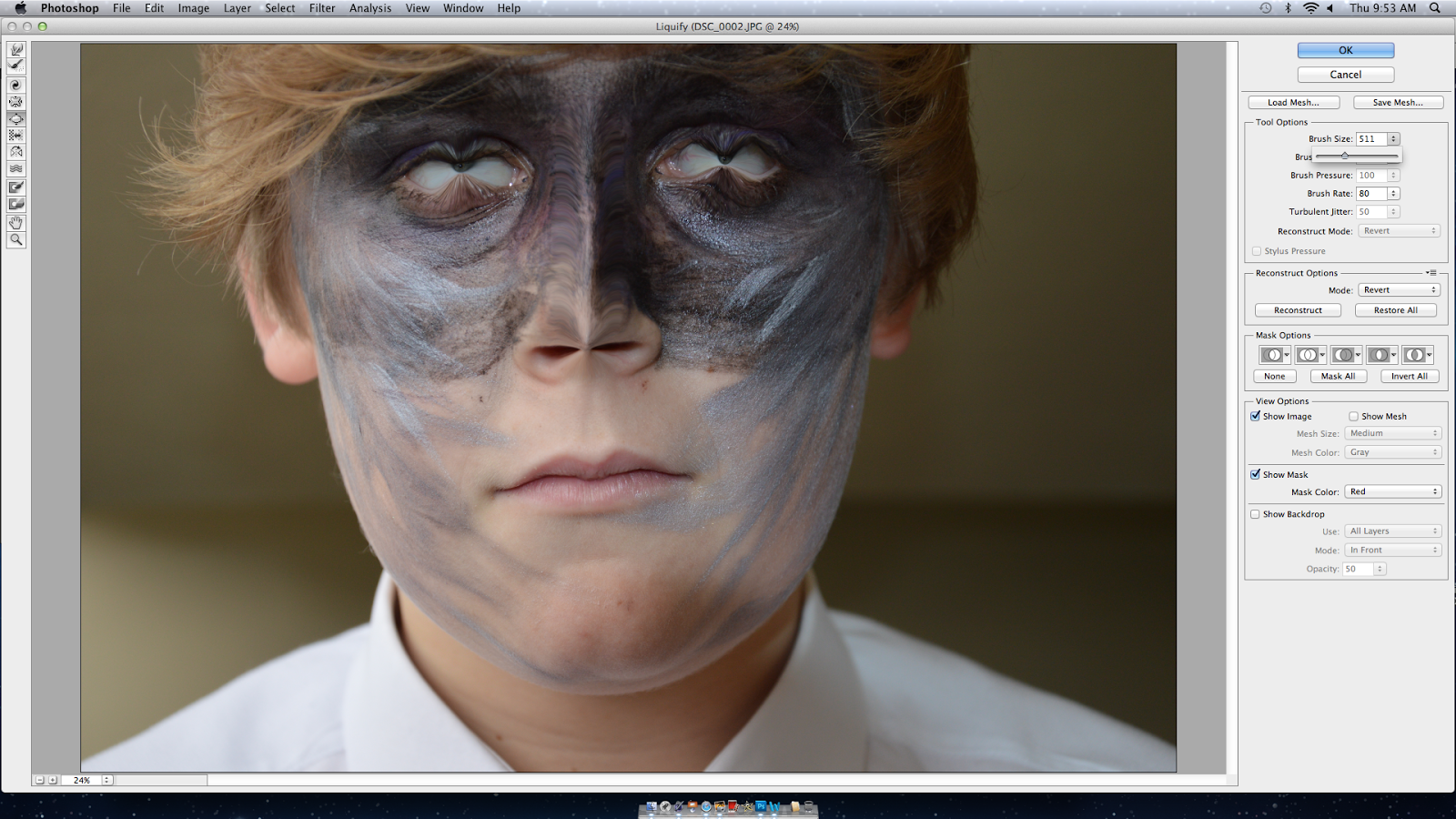
Here is my own photo in the style of Francis Bacon along with some screen shots of the process.

I altered the contrast and saturation to make the colors more obvious and bright. The colours in Francis Bacons photographs are very important as they portray the emotion.


I used the Liquify tool to create all of the different distortions, changing my brushes to pinch, bloat, stretch and twist helped to create a variety of effects.

Thursday, 5 June 2014

Transcriptions of Miguel's work


In both pictures I've made sure to transfer the pattern of the skin onto the arms/hands so it looks more realistic as though the people in the images are actually animals. I an most pleased with the top image because the expressions on the animal faces sort of actually fit onto the bodies. I like the Sphinx cat one as well because it almost looks like some Egyptian God but I think it would be a lot better if the body was in different clothes and a better quality image. I also like the background texture in this one.

To create these images I took an image of an animal and paired it with the body of a human. I used the lasso tool to separate the animal heads from their own body and attached them to that of the human.

Miguel Vallinas Prieto

Miguel takes the heads of animals and photoshops them onto human bodies; what he does is an example of anthropomorphism. He often makes it so the bodies the heads are placed on link to the animal, the clothing could link to their fur or their charecteristics. I think he probably uses tools like the lasso tool and clone tool to create these images. The backgrounds are mainly block colours, this helps to ensure that no attention is drawn from the strange content of the image. I like his images a lot  and think they are incredibly done. The links between the animal heads and human bodies are seamless which gives it a strangely real effect. 

Here are some examples of his work:


Anthropomorphism

Anthropomorphism, or personification, is attribution of human form or other characteristics to anything other than a human being. Examples include depicting deities with human form and ascribing human emotions or motives to forces of nature, such as hurricanes or earthquakes.

Claes Oldenburg's soft sculptures are commonly described as anthropomorphic. Depicting common household objects, Oldenburg's sculptures were considered Pop Art. Reproducing these objects, often at a greater size than the original, Oldenburg created his sculptures out of soft materials. The anthropomorphic qualities of the sculptures were mainly in their sagging and malleable exterior which mirrored the not so idealistic forms of the human body. In "Soft Light Switches" Oldenburg creates a household light switch out of Vinyl. The two identical switches, in a dulled orange, insinuate nipples. The soft vinyl references the aging process as the sculpture wrinkles and sinks with time.